How about actually selling your book to your readers? Is your cover design targeting the reader most likely to buy your book? Your cover must all at once catch the eye and instantly convey the message, “This is the book for you.”
Take note of these proven book cover design tips that will help you grab your readers by the eyeballs and communicate a strong, compelling message intended to zero-in on their hot buttons.
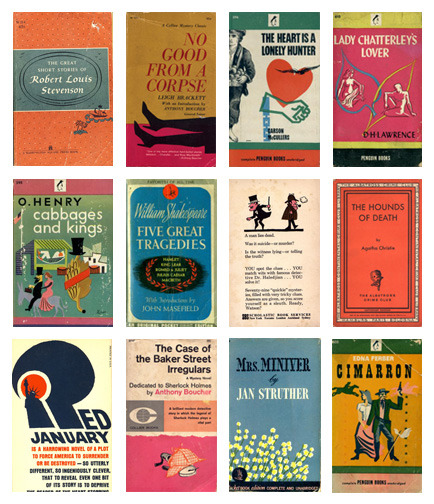
1. Your Cover’s Image Should Reflect What’s Inside
You want your readers to know that your book is of interest to them. But how do you do this without them actually opening and reading it? That’s the whole point of your cover: to tell them that the story they are looking for is found within.
Readers know what they are looking for. Make it clear to them that there is a truly thrilling mystery inside for them to solve or that your book will teach them everything they ever wanted to know about a specific topic.
2. Your Cover’s Typography Should Tell a Story
Typography is the style and positioning of the words on your book’s cover. Every word should have a definite meaning and serve a specific function. That purpose is to tell your readers a succinct, concise story that will encourage them to buy your book.
Take note of the following typographical guidelines:
• Your choice of type face, font size, style, and color will make an impact on your cover’s design. The words must be a part of the overall image you are trying to create.
• Isolating a particular word or words immediately increases their significance. By doing so, you are calling the reader’s attention to them. This may be a good idea if you are a famous author and can sell books by your name alone. But in other cases it might dilute your cover’s intent.
• Positioning is crucial. The most important element of your message should be at the top of your book’s cover.
3. Choose Every Element of Your Book Cover for Harmony
Typography, illustrations, design, size, positioning, color, and every other visual element of your book’s cover must be organized in a fashion that communicates their overall message to your reader clearly, quickly, and efficiently. Remember,
• The larger the size of the element, the greater its importance to the overall message.
• Use color to make a particular element pop.
• Position each element in a way that your reader’s eyes flow from one to the next as though they are being told a visual story.
For more book marketing tips, head over to the iUniverse Writers Tips and learn from the experience of iUniverse self-published authors.


0 comments:
Post a Comment